Caroga
Hired for the brand, guidelines and specs: I delivered those and the website they were for
Caroga · 2026 · 1 month (part-time)
A client hired me for a visual identity, guidelines and a website design, packaged as specs so he could build the site himself with AI. I drew the brand by hand and built a design system of 119 tokens and 146 component variants, paired with 9 coded components, plus guidelines a machine could read. Then I did the one part the brief left to him: I built the site.
This case is short on purpose: the whole site is running at the bottom of the page.
The brief
A client came to me with a business idea: Caroga, a data and technology consultancy. The company already existed as an idea, but to reach clients it still needed a face, an identity.
Usually I put the brief together myself, from a conversation with the client and some desk research. This client knew the process well and had already written it for me: a file in markdown, of all formats.
It listed fifteen items across three phases: brand, guidelines and the website design. Designing the site was in the contract, but building it was up to him. The end of the list said exactly this:
In other words, there was a step 16, turning my design into code, and it wasn't on the list because he was going to do it himself. That's where I saw the chance to deliver more than the contract asked for, and to put into practice what I'd been studying for the past few months.
Item 15 explicitly asked for a handoff to an agent. But if my job was to get everything ready for an agent to build a site I had conceived and designed, why not take the last step and hand the client the finished project myself?
Instead of preparing the handoff for an agent, I became the agent, operating another agent.
The plan
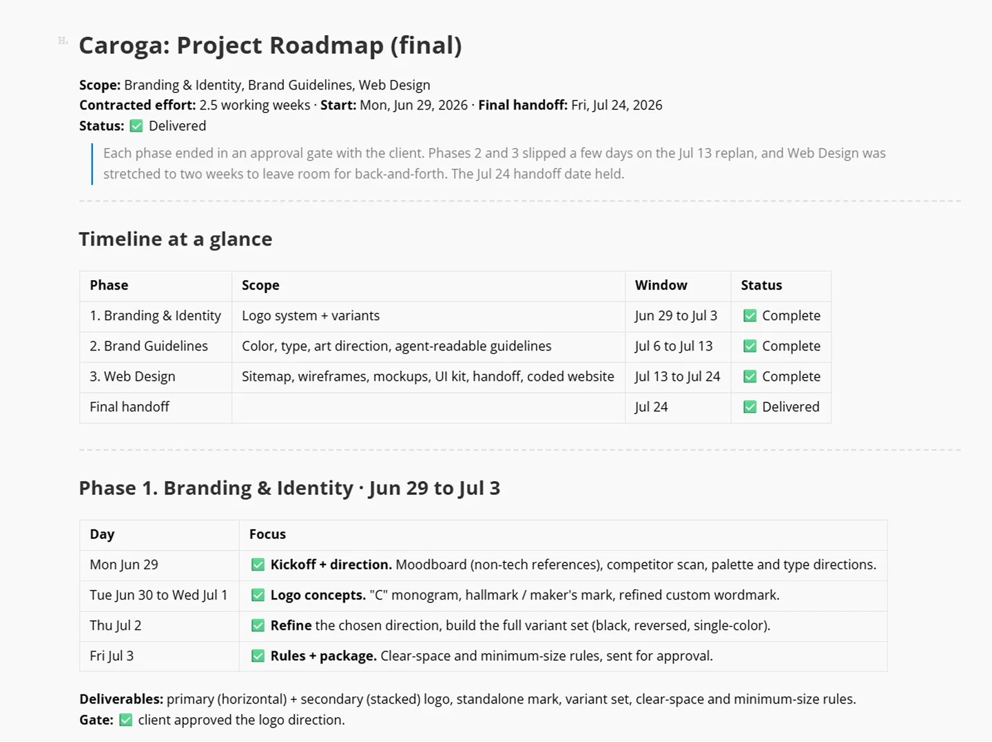
The first thing I asked a model for was a calendar built on the fifteen items: three phases, with a client approval gate at the end of each. That file ended up running the whole project.
The brand
The brief asked for a wordmark-led brand, where the name would do almost all the work.
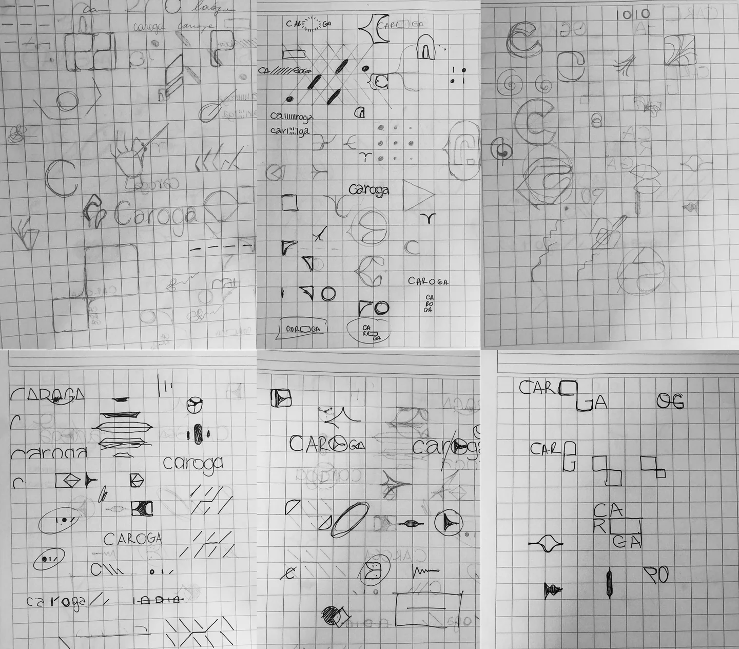
I started in a notebook, before opening any tool. It was open exploration with no concept yet: lots of different symbols and logotypes, playing with the letter C, with tech elements, with whatever showed up.
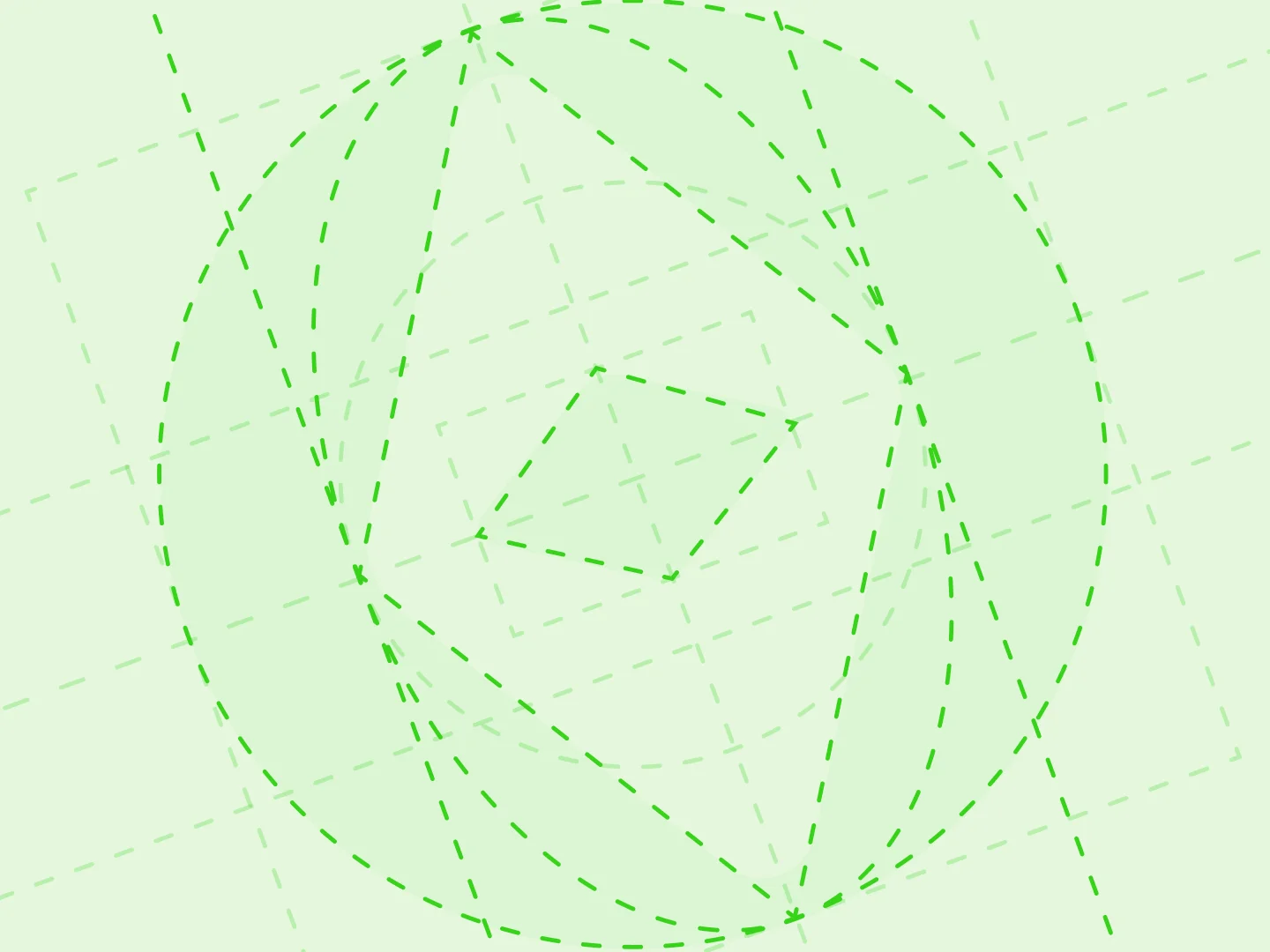
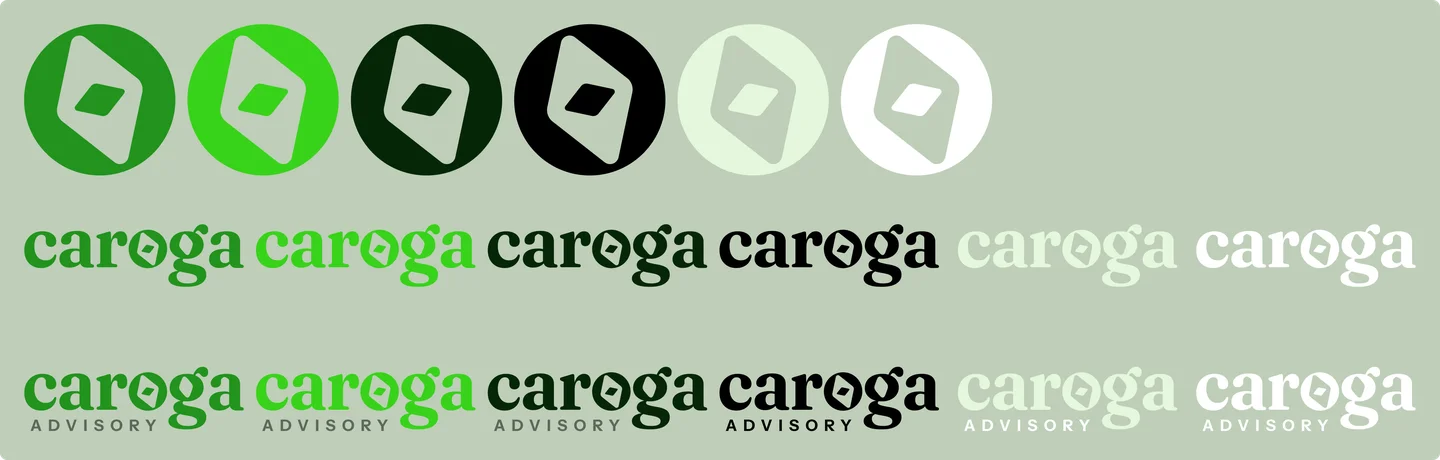
The concept came later, out of what the company sells: direction. Caroga helps clients use their own data to make better decisions, so the symbol became a compass. After some back and forth, it ended up inside the word, in the “o”.
For the wordmark I chose Fraunces. A serif carries sophistication and care, and care is a word that belongs here: Caroga sounds like care, and the site plays on that on purpose.
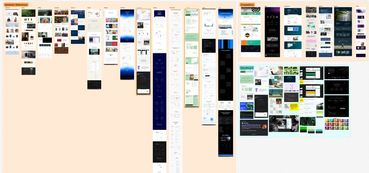
In my reference study, companies at the frontier of AI were trading tech’s default geometric sans for high-contrast serifs. It’s an editorial signal, one that lends weight to things too new to have a history. And Fraunces is on Google Fonts, which solved the brief’s requirement that everything work even in Google Slides.

The system
The brief asked for a guidelines PDF. When I asked the client what the document was for, he told me he’d use it as context for his agent.
If the next reader was going to be an agent, the best move was to write in its favorite format: markdown. Sure, a .md file has its limits. So every time I needed to mention an image, an object or an asset, I made the markdown point to exactly where that file lived.
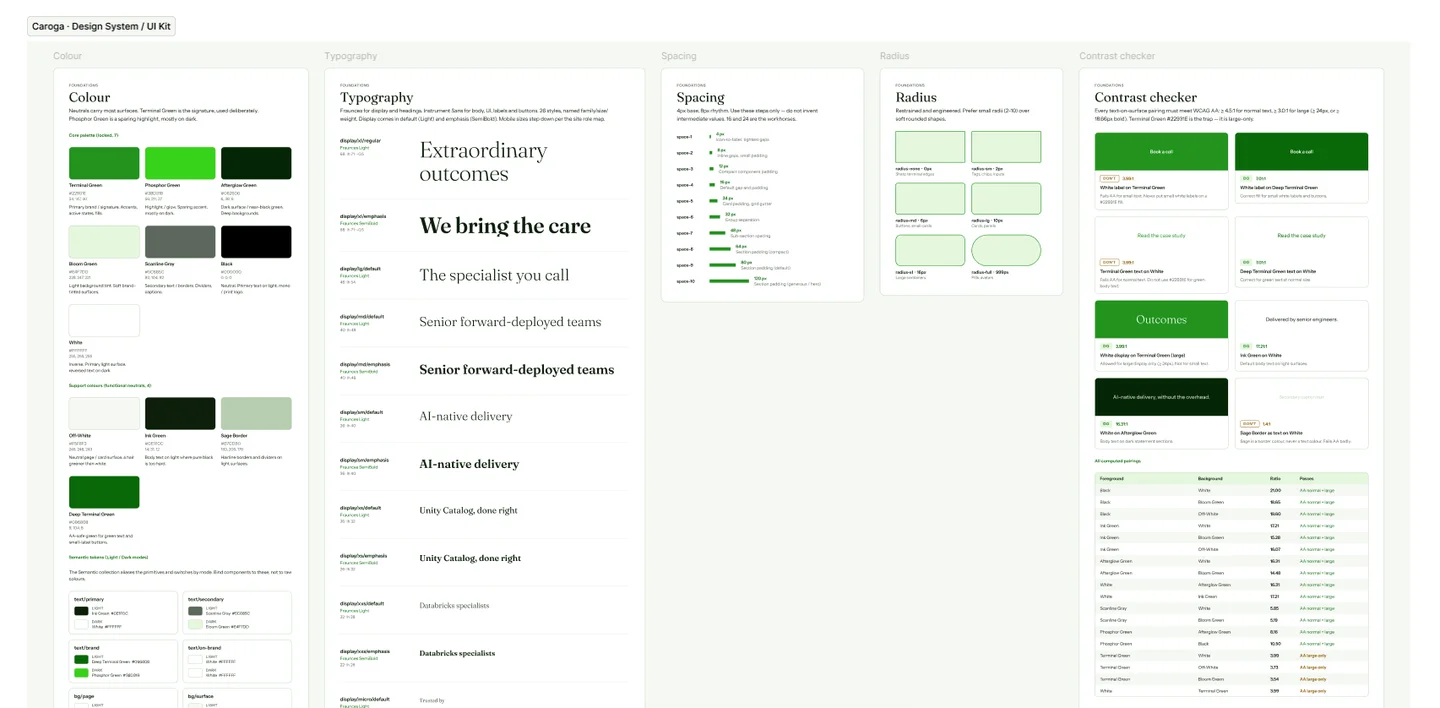
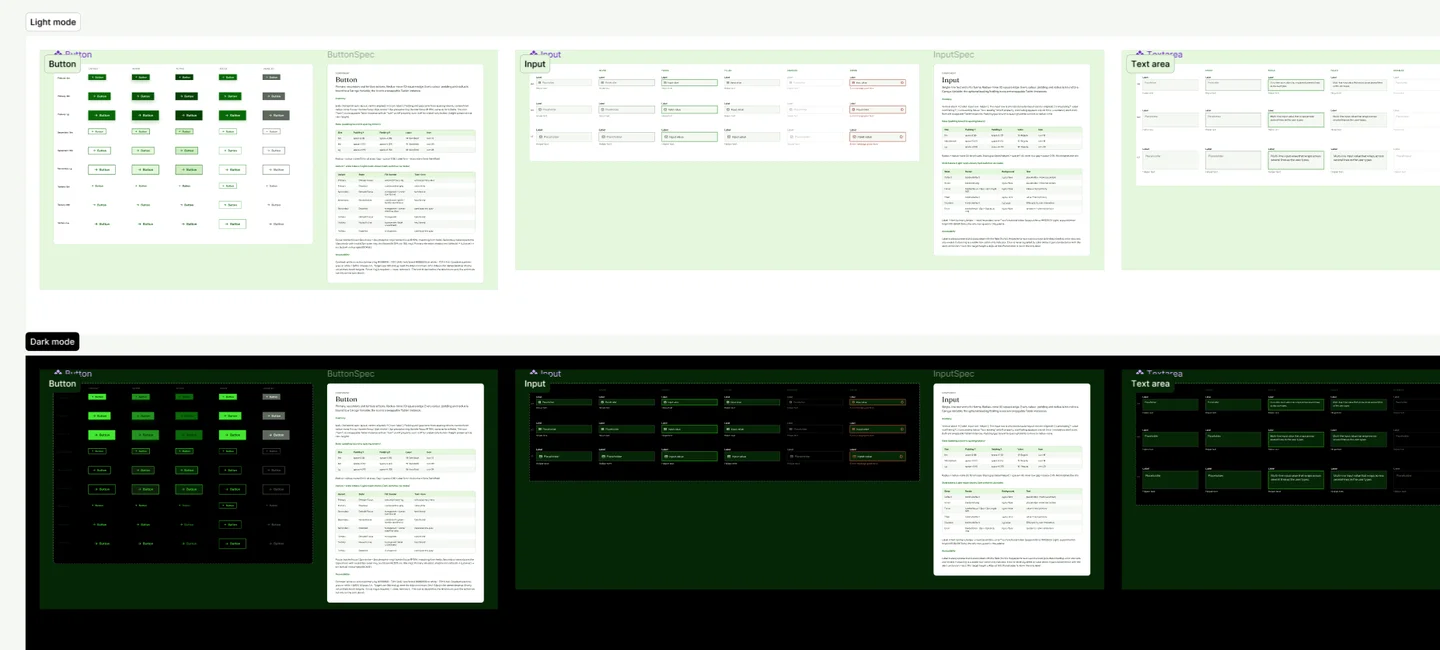
The Figma kit followed the same principle of being made for a machine to read: 119 tokens with light and dark modes, 146 component variants across 8 families, paired with 9 React components, and every contrast pair already computed.
The initial React component package came out of Claude Code, and I reviewed it. Then the agent itself rebuilt the components in Figma through the MCP: I connected it, gave the command and supervised, in short steps so it wouldn’t blow through tokens or context.
From then on, every adjustment I made in Figma, I had it replicate in the library.
The site
The layout was mine. It started in Figma and then moved to Claude Design, which quickly became the source of truth.
I left the code choices to the agent, and it suggested the simplest route to build: no animation library, everything on native browser APIs.
The hero dither is a WebGL shader, the flickering grids are Canvas, the entrances use IntersectionObserver, and the stepper reads the scroll with requestAnimationFrame. The only third parties are React (the base of Claude Design), Tabler icons and Google Fonts.
The home is a single page, in six blocks:
- Hero: the brand’s promise over the moving dither, plus the client strip
- Who we are: three cards (Databricks specialists, forward-deployed engineers, AI-native delivery)
- How do we work?: a three-step stepper pinned to the scroll (Assess, Embed, Ship)
- What we do: the four services, with the brand’s needle turning as the page scrolls
- Outcomes: three numbers and the final CTA
- Footer
Besides the home, I delivered one interior page, Services.
A good part of the motion came from references on 21st.dev: grid effects, the carousel, the scroll behavior. I’d ask Claude Design to break each effect down into adjustable fields for color, size and timing, then tune them by hand until they fit the brand. The site’s images were generated with ChatGPT and Gemini.
What I learned
- The most important and valuable one: tell apart what’s a job for AI and what’s a job for a human, and don’t mix them. I lost hours fixing AI’s suggestions when it was the one designing, but almost never had to fix anything when the design was mine and AI only executed it. The filter is simple: if it has to be unique, it’s a human’s job.
- AI is amazing at helping you think through exploratory brand concepts, analyze competitors and synthesize findings. The Mobbin MCP even gave me a real hand finding references for my client’s site faster.
- If you’re a designer, the canvas is the best place to keep your design. By delivery day, Claude Design no longer had a built-in canvas like it used to, so if you don’t know the code, every change costs tokens, even basic ones like fixing spacing. Keep that in mind when you decide where the source of truth lives (Figma or code).
- If I started this project over today, I’d draw the entire high-fidelity look in Figma before opening the model, and use Claude Design only to refine what was already decided. I’d also show the agent the overall structure of the site, but build the sections one by one in separate conversations, to use context windows and tokens efficiently.