Last mile
Truck drivers were in a hurry, the app wasn't: I cut the common delivery from 16 taps to 8
Global beverage company (NDA) · 2024 · 2 weeks, 10 working days
I was handed a proof of concept for a new version of a global app used by truck drivers. I looked at how they actually used it, walked the visit from start to finish, and cut the common delivery from 16 taps to 8. Twelve drivers tested it across four tasks: 44 of 48 completed (~92%), and 10 of 12 said they would switch versions on the spot.
The setup
My manager handed me the redesign of the main app we had for truck drivers. Inside it, drivers pulled up their route, saw their deliveries, and handled payment and inventory along the way. At the time the app was running in 6 countries and growing fast.
The project landed on my desk with four points attached:
- The app was modular in both infrastructure and experience, so it could bend to whatever each country's operation demanded.
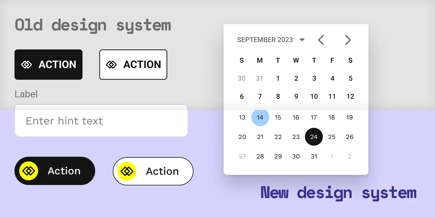
- The product had to run on the company's new design system
- We were expanding into new countries and needed to simplify what we already had
- The concept would focus exclusively on the delivery task
Before anything else I went to look at the driver's day and how he actually used the tool. He leaves the distribution center in the morning with a route, a loaded truck and, often, a helper. At each stop the same sequence repeats: he confirms the inventory with whoever runs the store, unloads and hands over the products, checks whatever else is pending, takes the payment, collects proof of visit, closes it and drives to the next one.
An informal check with the data team put that flow at 90% of all visits.
Drivers were almost always assigned to the same routes and the same stores, because familiarity makes them faster. Now and then, though, the driver and his helper had to do something else: pick up empty crates (a loan system), register a swap request, collect damaged product, or log whatever unexpected thing had just happened.
In the app it made no difference. Delivery, swap, pickup: the experience gave all of them the same weight.
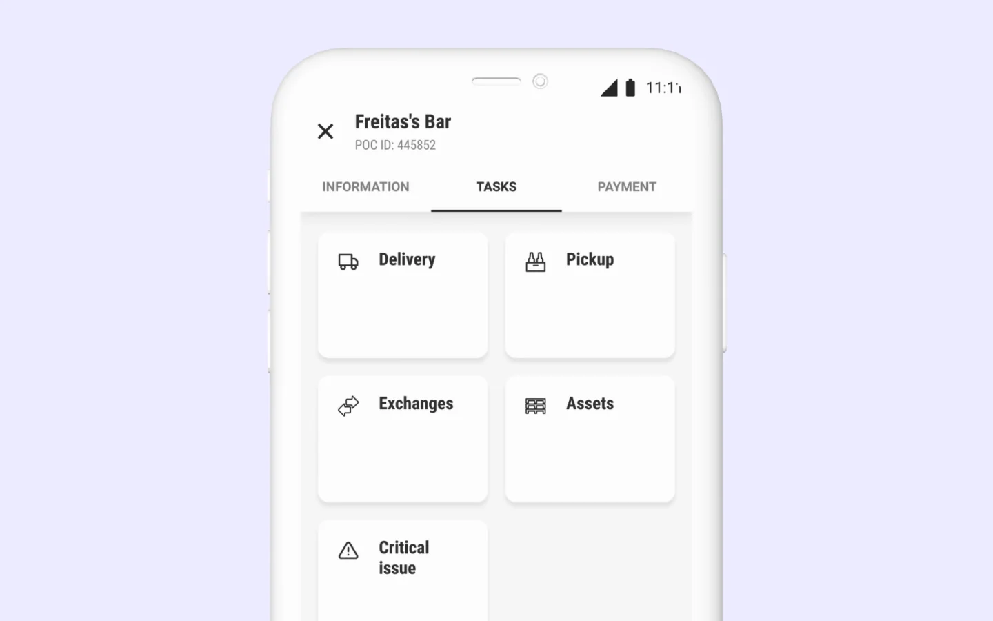
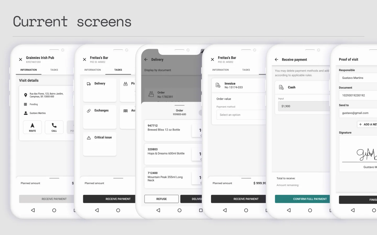
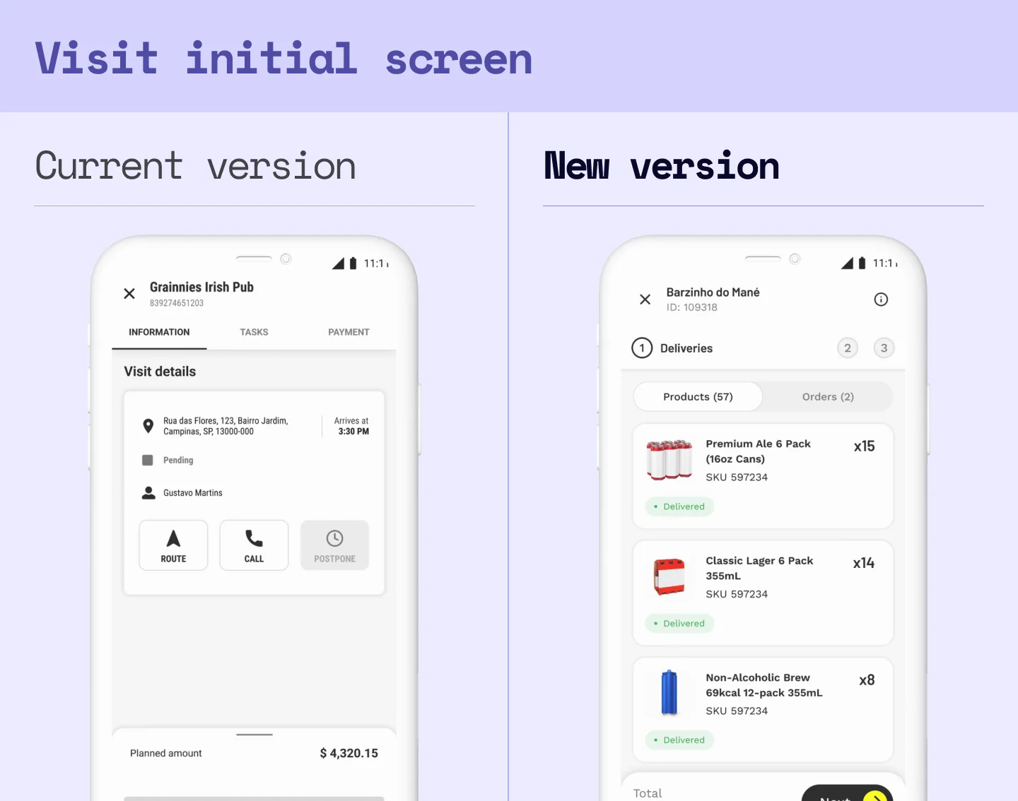
The other thing that caught my eye was how a visit was laid out: three tabs, Information, Tasks, Payment. The design assumed a sequence. The driver would read the store's details (contact, manager, opening hours), do the tasks for that visit, review the payment information and finally move on to collecting the money.
Looking at the product we had and crossing it with earlier research, a few things stood out:
- Drivers skipped the Information screen by default. They already knew their routes and their stores.
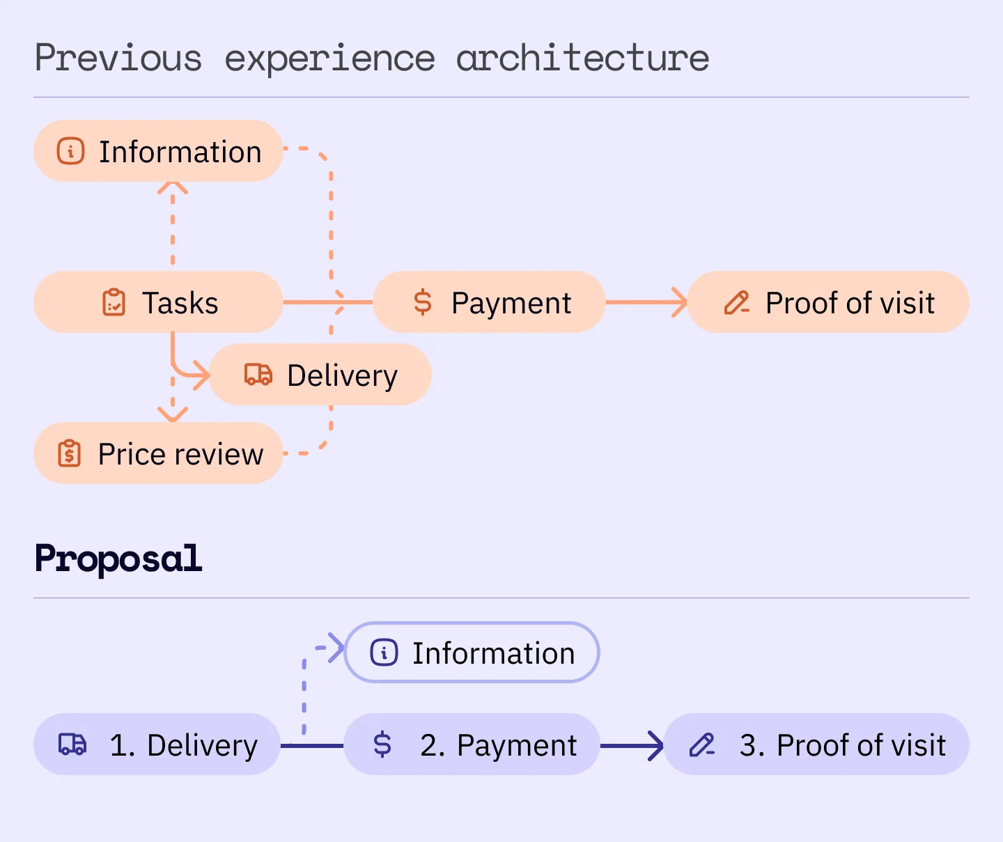
- A delivery follows an order nobody negotiates (do it → settle the payment → collect proof of visit), and the main screen used tabs: a component that says these things are equivalent and interchangeable, never that one comes after the other.
- I counted the taps of a common delivery in the old app: 16, not counting typing.
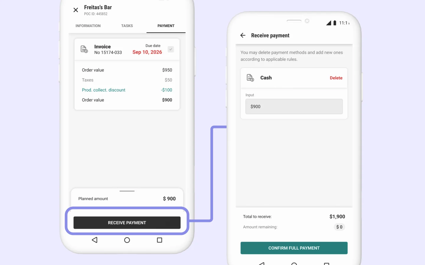
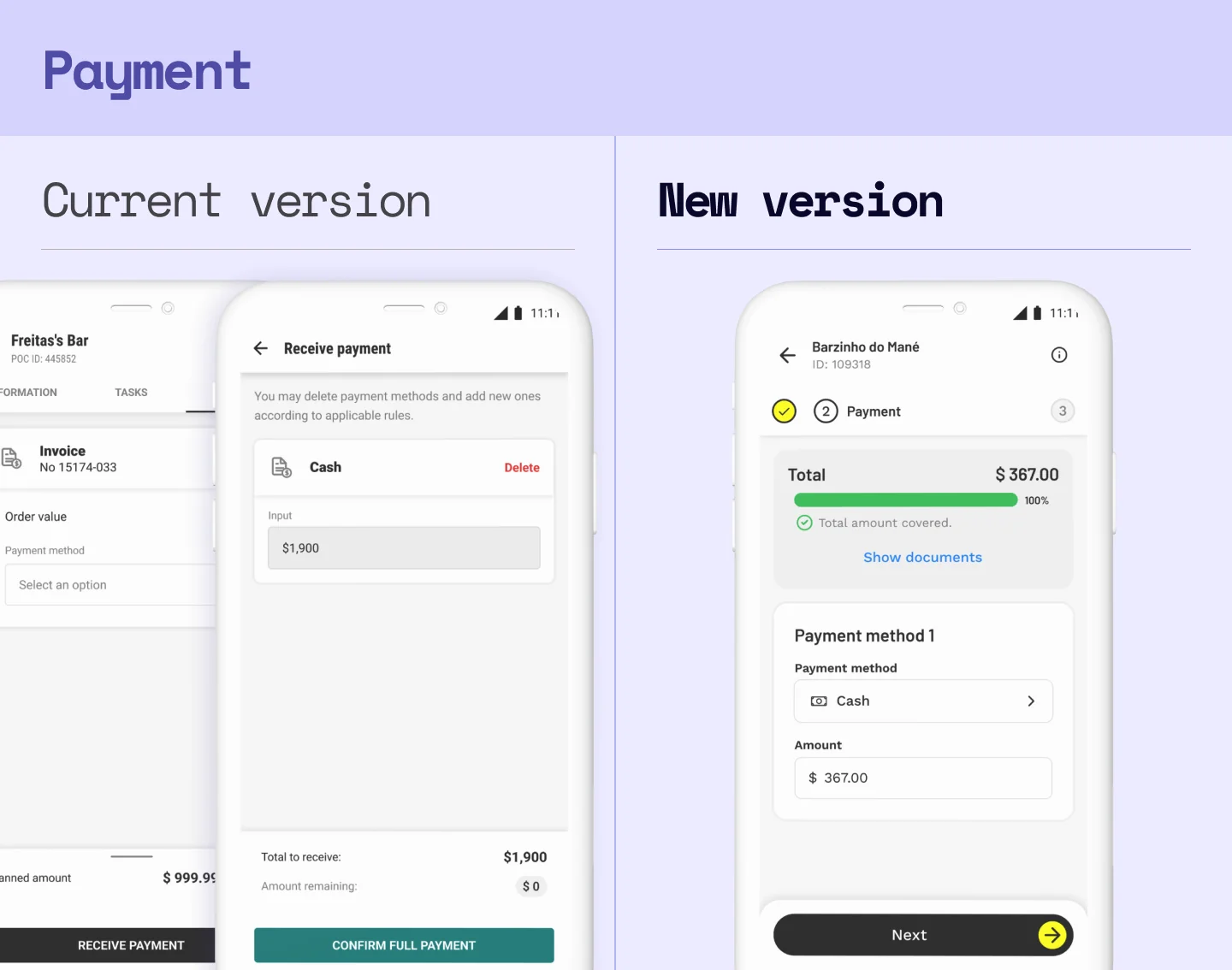
- The payment tab was a review screen. The payment flow itself only started when you hit the button at the bottom.
All of this charged a price in two places. It charged the driver, in cognitive load and friction he did not need to carry. And it charged the business: the longer a driver takes to register a visit, or to learn how to use the app properly, the less efficient and the more expensive that operation gets.
Item four said delivery and nothing else. I have sat in enough of these rooms to know that somebody would ask about the rest.
The bet
I put the main use case at the heart of the project and brought in what the physical flow already had: linearity.
I did not invent that order. The driver already does it in the same sequence at every stop, and the app was the only place where it was optional.
Design decisions
With all of that in hand, the findings and the bet turned into four design decisions.
1. Fixing who gets the spotlight
I swapped the entry point from Information to Tasks. The driver stops landing on a screen he has to read and lands on the thing he has to do. And if the only task in this version is the delivery, he should see exactly what he has to deliver the second he opens the visit.
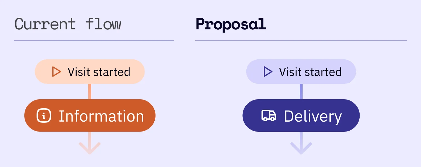
2. Making the linearity visible
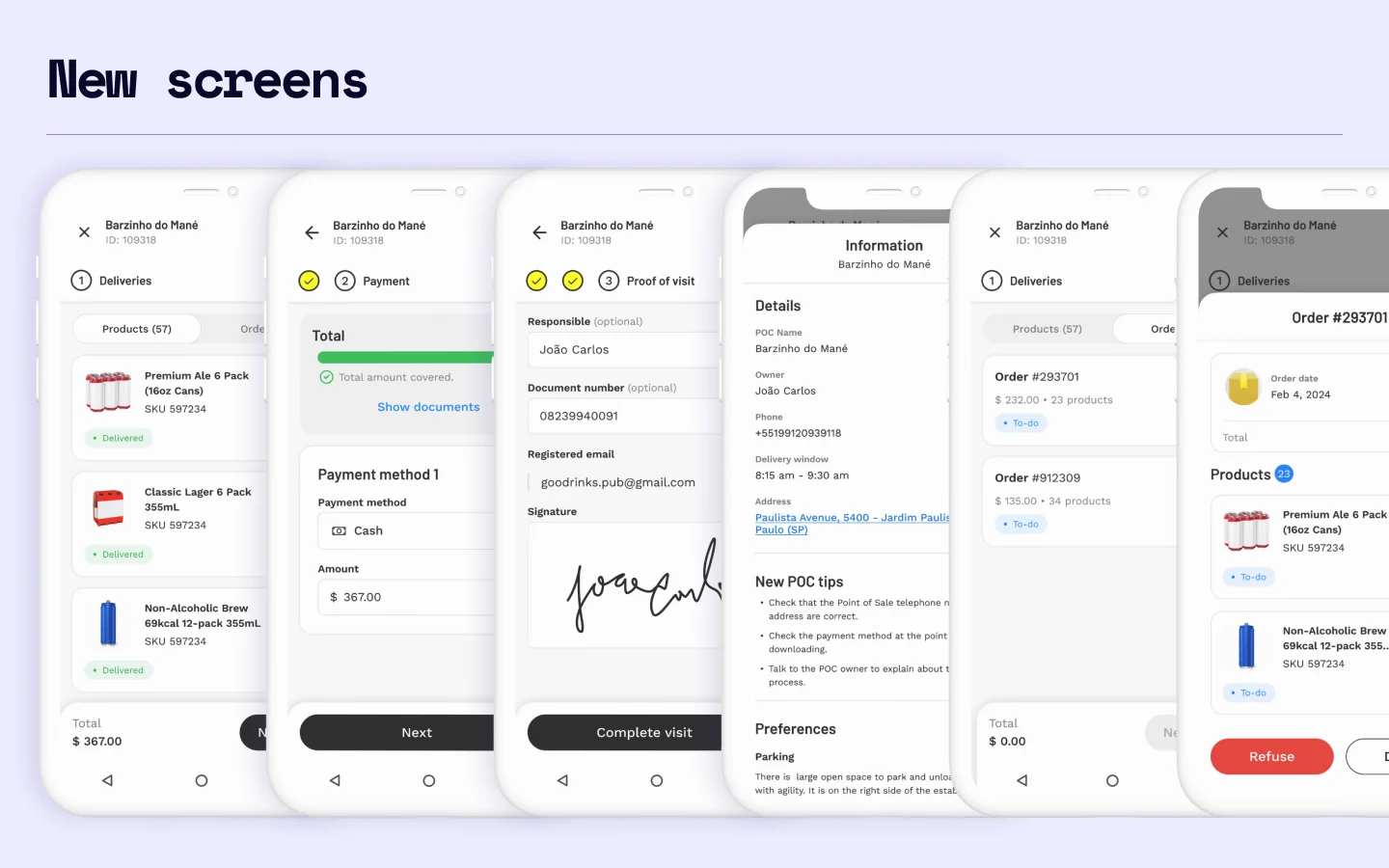
I replaced the tabs with a stepper. The idea was to make the digital experience follow the physical one, so the visit reads the way it is actually done.
3. Merging the payment screens
I looked at the two payment screens, crossed them with earlier research on how drivers behave, and joined the two sections into one. If a driver has a doubt about the payment documents, he can check them on the same screen where he settles the payment.
4. Rebuilding the flow on the new design system
It was in the brief and I wanted to see the product with its new face. But the tap savings did not come from there: they came from the flow.
The proposal
Typing aside, I designed a new journey for the most common visit and cut it by 50%: from 16 taps to only 8.
| Taps per step | Current version | New version |
|---|---|---|
| Confirming the delivery | 6 | 2 |
| Collecting the payment | 5 | 2 |
| Collecting proof of visit | 5 | 4 |
| Total | 16 | 8 |
Testing the proposal
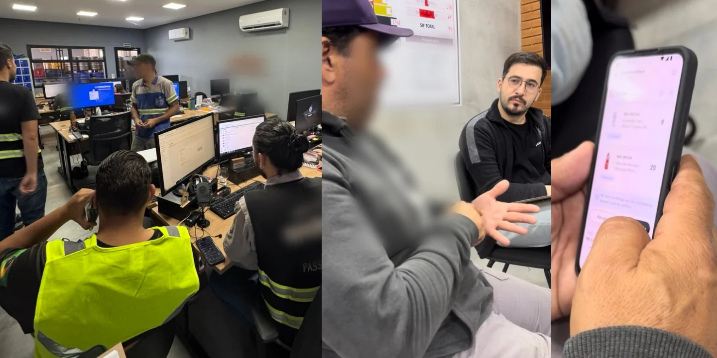
I took it to the field. Twelve drivers, two distribution centers: Piracicaba, with a tidy operation, and Campinas, with a chaotic one. Two levels of operational maturity give you far more than two similar places would.
Before every session I said three things: that I was not the one who had designed this, that he could be blunt with me, and that the thing being tested was the design and not him.
People who work in operations are afraid of getting it wrong in front of someone from the office, and they answer what they think you want to hear. Those three sentences are what makes the number at the end of the session worth anything.
I recorded the audio on my phone, ran it through transcription, fixed by hand what the transcription got wrong, and used the company's AI tool to group the material into patterns. I reviewed all of it before using any of it. That is what gave me, alone and in four days, the synthesis that normally takes a research team.
| Flow tested | Completed |
|---|---|
| Starting the visit | 12 of 12 |
| Doing the visit | 12 of 12 |
| Refusing a specific order | 11 of 12 |
| Showing documents | 9 of 12 |
| Total | 44 of 48 (~92%) |
At the end of each session I asked one question: if you could swap the app in your hand for the one you just used, would you? Ten of the twelve said yes, and this is the same audience we had labeled, before we started, as resistant to change.
Taking it to leadership
I presented it to the director of our vertical, the Design Manager, other designers and other PMs. It landed well and became a reference for the team. And it stuck: months later the app was redesigned drawing on what this concept proposed, according to the people who stayed there.
What did not come with it was the date. The build got reprioritized and, by the time it turned into a task, I was already on another front.
Oh, and the question I saw coming did come up:
“And what if there's a pickup or a swap?”
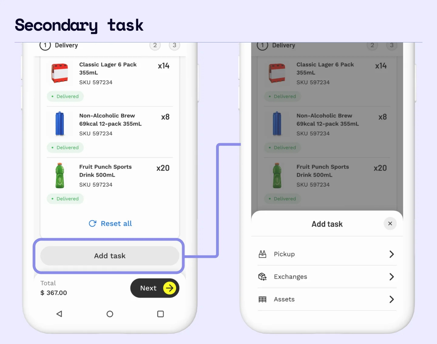
I had a card up my sleeve. I explained that the experience could grow to cover the other tasks on one condition: it had to keep treating them as secondary.
What I had ready was the door, not the rooms behind it. Those flows already existed and everyone in that room knew them, so with two weeks on the clock the only part worth designing was where they would now be entered from.
What I learned
- Today I would push my design manager further before accepting a project with its constraints attached. I would want the whole picture: who knows about it, what the real goals behind it are, what the risks and the consequences are, and what people expect from it.
- Next time I would agree with leadership on testing beyond the distribution center, riding the route with the driver. Using the app inside the truck, maybe with one hand, sun on the screen, bad signal, the truck rocking, a cheaper phone: those details are what tell you whether the experience actually fits the driver's day.
- And I would turn the data questions I asked the team into a written report instead of an informal check, so the discussion has something firmer to stand on.